KQL and Azure Monitor for AI: logs, dashboards, Workbooks, and alerts
Turn Application Insights telemetry into investigations, operational dashboards, interactive Workbooks, and proactive alerts for distributed AI pipelines.
Suggested study time: 120 minutes • Intermediate • Complete original rewrite with a concise version of every topic, assessment review, and guided lab
By João Ricardo Dutra••Complete original content
1. Scenario and learning objectives
An enterprise content-moderation pipeline receives documents through an ingestion API, classifies them with a model, extracts entities, and checks policy violations. Some documents exceed 30 seconds, certain formats make moderation fail, and users currently discover the incidents before the operations team. The target state is a health view for the whole pipeline, an alert within five minutes of a failure surge, and an interactive investigation by time, service, and document type.
Retrieve and analyze Application Insights telemetry with KQL.
Find error patterns, dependency bottlenecks, and performance trends.
Build a shared Azure dashboard for ongoing operational awareness.
Create parameter-driven Azure Workbooks for investigation.
Configure alert rules, action groups, and anomaly detection.
Quick recap
The monitoring design must progress from raw telemetry to questions, visual context, interactive diagnosis, and timely response.
2. KQL and the query experience
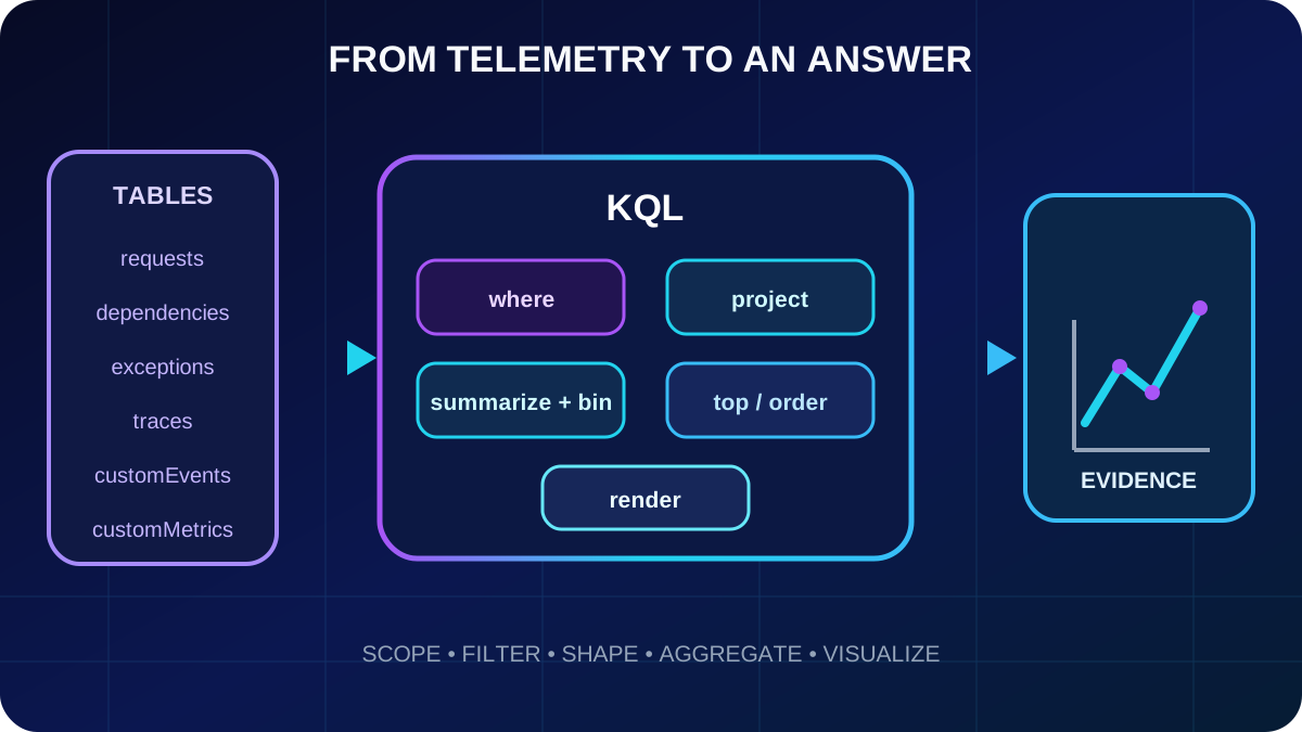
Kusto Query Language (KQL) is used by Logs, Log Analytics, and . A query starts with a tabular source and passes its result through operators separated by a pipe. Every stage receives the previous table, transforms it, and emits another table, so the logic reads from top to bottom.
Log Analytics in the provides completion, syntax highlighting, time controls, tabular results, and charts. It can be opened from , an Application Insights resource, or a Log Analytics workspace. The selected scope determines which resources, schemas, and table aliases are available.
Each pipe operator performs one explicit transformation, which keeps investigations readable and easy to change.
Quick recap
KQL is a tabular transformation pipeline; scope first, then compose one clear operator per analytical step.
3. Application Insights tables and shared correlation fields
Core telemetry and where to investigate it
Application Insights table
Workspace table
Purpose
requests
AppRequests
Incoming operations, duration, response code, and success.
dependencies
AppDependencies
Outbound database, HTTP, Azure service, model, vector-store, and microservice calls.
exceptions
AppExceptions
Handled and unhandled errors, messages, types, and stack details.
traces
AppTraces
Application log statements from supported logging frameworks.
customEvents
AppEvents
Explicit business events such as document classified or moderation flagged.
customMetrics
AppMetrics
Application measurements such as queue depth or confidence.
performanceCounters
AppPerformanceCounters
Host CPU, memory, I/O, and related system counters.
Resource-scoped Application Insights queries commonly expose the short table names; workspace-scoped queries expose App-prefixed names. Shared context matters more than the alias: timestamp places an event in time, operation_Id connects one distributed operation, cloud_RoleName identifies the emitting service, customDimensions stores developer-defined context, and itemCount expands sampled rows into represented events.
Quick recap
Choose the table by telemetry type and preserve operation_Id, cloud_RoleName, customDimensions, and itemCount for correlation and accurate analysis.
4. Filter, select, inspect, and rank rows
Use where for predicates, project for a narrow and named output schema, take for an arbitrary sample, and top when order matters. Exact comparisons use operators such as ==, !=, >, and <. For text, has uses term indexing and is usually preferable for whole terms; contains searches substrings and can cost more at scale; startswith matches a prefix. Combine predicates with and or or.
requests
| where timestamp > ago(1h)
| where success == false
| project timestamp, name, resultCode, duration, cloud_RoleName
| top 20 by duration desc
This query limits the time window, keeps failures, exposes the fields needed by the responder, and returns the twenty slowest entries. A deliberate project step also prevents unrelated or sensitive dimensions from spreading into exports and dashboard tiles.
Quick recap
Filter early, project only diagnostic fields, and use top instead of take whenever “largest,” “slowest,” or “newest” is part of the question.
5. Aggregate trends with summarize, bin, and percentiles
summarize converts individual rows into evidence about groups. count(), sum(), avg(), min(), and max() answer common totals and statistics. dcount() estimates distinct values efficiently, while count_distinct() is exact but heavier. percentile() reveals tail behavior that an average can hide.
A datetime should normally be grouped with bin(). Without a fixed bucket, millisecond timestamps fragment a time series into almost one group per event. The grouping columns after by determine the granularity of the result.
summarize defines the question, bin defines the time grain, and percentiles expose the slow tail that averages smooth away.
6. Visualize a query with render
render adds a visualization hint to the final result. timechart is the natural choice for time-bucketed metrics; barchart and columnchart compare categories; piechart shows a carefully limited part-to-whole distribution; and areachart emphasizes accumulated or stacked movement. The result pane can change chart types interactively, but keeping render in a saved query preserves its presentation when shared or pinned.
Match the result shape to the visual
Question
Recommended visual
How does p95 change over time?
timechart
Which service has the most failures?
barchart
What is the request share by service?
piechart with few categories
What are the exact latest failures?
table/grid
Quick recap
A chart is useful only when its axes and categories match the result shape; render records that intent with the query.
7. Investigate exceptions without losing sampled volume
Begin an incident by measuring scope: when did the error rate move, which exception types dominate, and which operations are affected? With ingestion sampling, count() counts stored rows, not necessarily real events. sum(itemCount) reconstructs the represented volume and is therefore the correct aggregation for sampled counts.
exceptions
| where timestamp > ago(24h)
| summarize exceptionCount = sum(itemCount)
    by bin(timestamp, 1h), type
| render timechart

exceptions
| where timestamp > ago(24h)
| summarize exceptionCount = sum(itemCount)
    by type, operation_Name
| top 10 by exceptionCount desc
The time chart reveals the start and shape of a spike; the ranked aggregation narrows it to an exception and operation. A document pipeline might, for example, reveal that timeouts concentrate in one classification endpoint rather than across every service.
Quick recap
Use sum(itemCount) for sampled event volume, then pivot from the time of the spike to exception type and affected operation.
8. Correlate requests and exceptions with operation_Id
A distributed failure is rarely explained by one table. operation_Id is the stable key that links requests, dependencies, exceptions, and traces belonging to the same transaction. Join only the necessary columns and rename duplicates inside each branch before the join; otherwise KQL adds suffixes to ambiguous names.
The combined row answers whether an exception belonged to a user-visible request, how long that request took, and which cloud role handled it. Background exceptions with no matching request require a different join strategy, such as leftouter, rather than being silently interpreted as absent.
Quick recap
operation_Id rebuilds the incident across tables; project and rename before joining so correlation remains unambiguous.
9. Analyze dependency latency and failures
The dependencies table is often the shortest path to an AI bottleneck because model inference, embedding generation, vector search, storage, databases, and downstream APIs are outbound calls. Compare median, p95, and p99 by target and type, then separately examine unsuccessful calls by result code and originating service.
dependencies
| where timestamp > ago(24h)
| summarize averageDuration = avg(duration),
    p50 = percentile(duration, 50),
    p95 = percentile(duration, 95),
    p99 = percentile(duration, 99)
    by target, type
| order by p95 desc

dependencies
| where timestamp > ago(24h) and success == false
| summarize failureCount = sum(itemCount)
    by target, resultCode, cloud_RoleName
| order by failureCount desc
Interpret the result code in context: 429 commonly indicates throttling or exhausted throughput, 5xx points to a server-side dependency problem, and missing codes with long duration can suggest timeouts, connectivity trouble, or saturation. Percentiles show whether degradation is systematic or limited to a slow tail.
Quick recap
Rank dependencies by tail latency, then segment failures by target, code, and service to choose the correct capacity, retry, or reliability response.
10. Failures, Performance, and transaction diagnostics
Application Insights built-in views complement custom queries. Failures groups unsuccessful operations and exposes response codes, exception types, failed dependencies, and representative samples. Selecting a sample opens transaction diagnostics, where the chronological request, dependencies, exceptions, and traces reveal the causal chain.
Performance ranks operations by duration or volume and exposes response-time distributions. A split or bimodal distribution can show that one document type follows a much slower path even when the overall average looks acceptable. Start with these curated views for orientation; switch to KQL for joins, custom dimensions, specialized aggregation, or a reusable visual.
Quick recap
Built-in views locate the problem area and one concrete transaction; KQL tests the deeper hypothesis across the full dataset.
11. Azure dashboards for operational awareness
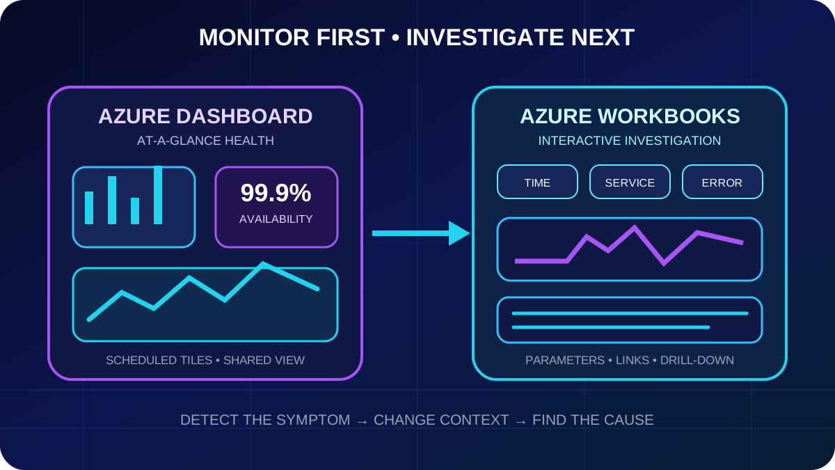
An Azure dashboard is a shared, relatively static tile surface in the . It combines metrics, log-query results, Markdown context, and resources from different subscriptions or resource groups. Its job is to answer “is the system healthy now?” during daily operations, stand-ups, or wallboard monitoring.
Server response time and latency percentiles.
Failed requests and failed dependencies.
Request rate and throughput.
Availability-test success.
A small set of business signals such as documents processed or moderation decisions.
Choose aggregation deliberately: average describes typical latency, sum counts events over a period, and max exposes an extreme. Apply filters or split by cloud role, operation, or result code when the chart must distinguish services.
Quick recap
A dashboard is a focused operational surface built from a few stable health signals, not an unrestricted incident-analysis canvas.
Run a query in Logs, select the appropriate chart, and pin it to an existing or new dashboard. A widening gap between p50 and p95 means most requests remain fast while a meaningful tail degrades. Tiles refresh periodically rather than continuously; use Live Metrics or a narrower interactive view when an active incident requires fresher evidence.
Keep roughly five to ten decision-oriented tiles.
Separate technical health from business outcomes when both would overcrowd one page.
Group latency, reliability, throughput, and availability into a predictable reading flow.
Use explicit titles such as “Classification p95 latency,” not generated query names.
Add a Markdown tile with ownership, runbook links, and escalation contacts.
Publishing shares the dashboard, but Azure RBAC still applies to the dashboard resource and every underlying data source. A viewer who lacks access to Application Insights sees an authorization error in the affected tile.
Quick recap
Pin only decision-ready queries, explain the dashboard’s purpose, and verify both dashboard and data-source permissions.
13. Azure Workbooks as interactive reports
Azure Workbooks combine text, log queries, metrics, parameters, and visualizations in a reusable report. Unlike a dashboard, a Workbook is designed to answer “why is the system behaving this way?” Users change scope, time, and filters while the dependent steps re-run.
The dashboard detects a condition; the Workbook lets the responder change context and follow evidence to a cause.
A Workbook is assembled vertically from text, query, metrics, and parameter steps. Query results can appear as grids, line or bar charts, tiles, or geographic maps. Microsoft templates for performance, failures, and usage can be customized, or the report can start from an empty canvas.
Quick recap
Dashboards monitor; Workbooks investigate through a parameterized narrative of data and explanation.
14. Parameters, conditional visibility, and drill-down
Time-range parameters coordinate temporal scope. Dropdowns can use static values or a KQL query, such as distinct cloud_RoleName values. Resource pickers let one report switch among Application Insights resources or workspaces. Multi-select parameters feed an in expression so investigators can compare selected services.
Use the native time-range token form when possible so the service supplies a safe predicate. Parameter syntax depends on the Workbook control and formatting option; inspect the generated value before injecting it into KQL. Conditional visibility can hide deep exception details until a service is selected. A grid link can open transaction diagnostics, another Workbook, or export the selected row as a parameter for downstream steps.
Begin with pipeline-wide health.
Expose time and service filters near the top.
Let a summary grid drive a service or operation parameter.
Reveal stack traces and dependency timelines only on demand.
Limit query steps because every parameter change can re-execute them.
Quick recap
Parameters coordinate scope; linked grids and conditional steps turn a summary into a focused investigation without loading every detail upfront.
15. Alert-rule anatomy, types, and severity
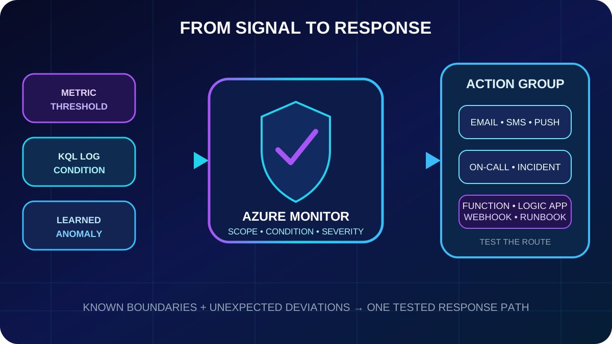
An alert rule combines scope, condition, actions, and severity. Scope selects resources; condition defines the signal and firing logic; one or more action groups notify people or invoke automation; severity communicates urgency from 0 Critical through 4 Verbose.
Choose the alert mechanism
Type
Best fit
Metric alert
A precomputed metric and straightforward threshold or dynamic threshold.
Log search alert
KQL logic, aggregation, joins, custom dimensions, or scheduled evaluation.
Simple log search alert
An individual matching log event should trigger rapid incident response.
Smart detection alert
A learned anomaly that was not practical to encode as one static limit.
Use consistent severities: production outage at severity 0, substantial functional impact at 1, emerging risk at 2, notable information at 3, and verbose diagnostics at 4. Severity should drive routing and response expectations, not merely color a portal badge.
Quick recap
An effective alert identifies what is watched, what evidence constitutes trouble, who or what responds, and how urgently.
16. Build actionable log search alerts
A scheduled log alert has three independent time controls: evaluation frequency determines how often KQL runs; window size determines how much data each execution examines; and the number of violations determines how many evaluations must breach before firing. These controls balance detection speed, cost, and resistance to transient noise.
// Failure-volume alert: return a row for every affected service.
requests
| where success == false
| summarize failedCount = sum(itemCount) by cloud_RoleName
| where failedCount > 10

// Latency-SLO alert: detect a p95 above three seconds.
requests
| summarize p95Duration = percentile(duration, 95)
    by cloud_RoleName
| where p95Duration > 3s
For the failure query, use a five-minute window and frequency and fire when the result contains more than zero rows; each row identifies a service with more than ten failures. For latency, p95 above three seconds protects the experience of the slowest five percent better than an average. Include enough identifying columns for the fired alert, but keep the query deterministic and within alert-query restrictions.
Quick recap
A threshold query should return only actionable breaches; frequency, window, and violation count then control sensitivity and noise.
17. Action groups and automatic anomaly detection
Action groups are reusable sets of receivers and automated actions. Notifications include email, SMS, mobile push, and voice. can invoke ,, webhooks, Runbooks, , or incident-management integrations. One alert can use multiple action groups, and one group can serve many rules.
Separate critical routing from warnings: a critical group may page the on-call engineer and create an incident; a warning group may email the owning team. Test every group before production and use the common alert schema where downstream automation benefits from a stable payload.
Smart detection learns a historical baseline and identifies unusual failure or performance behavior. Failure anomalies can cluster affected operations, users, exceptions, and dependencies; performance anomalies can catch gradual latency or exception-volume changes. Manual rules enforce known SLOs and business limits, while anomaly detection searches for unexpected deviations.
Known thresholds and learned anomalies converge on reusable notification and remediation paths.
Quick recap
Use action groups to standardize response, manual rules to enforce known boundaries, and smart detection to cover novel deviations.
18. Guided lab: query telemetry and create an alert
The practical exercise provisions Application Insights, generates representative request, dependency, and exception telemetry from Python with OpenTelemetry, investigates it in Logs, and creates an action group plus a scheduled query rule. Prerequisites are an Azure subscription, , Python 3.12 or later, and a current Azure CLI.
Create a resource group and Application Insights resource, then capture its connection string without committing it.
Run the supplied or equivalent Python generator for successful, slow, dependency-failure, and exception paths.
Allow for ingestion delay; confirm data in requests, dependencies, and exceptions.
Query failed requests and use sum(itemCount) for sampled totals.
Join exceptions to requests with operation_Id.
Calculate dependency p50, p95, and p99 and segment failures by target and code.
Create and test an action group.
Create a scheduled-query alert with an explicit scope, window, frequency, threshold, severity, and action group.
Trigger the condition and verify both the fired alert and its notification.
az monitor app-insights component create \
  --app ai200-telemetry --location <region> \
  --resource-group <resource-group>

# After generating request, dependency, and exception telemetry,
# create an action group and a scheduled-query alert rule.
az monitor action-group create \
  --name ai200-oncall --resource-group <resource-group> \
  --short-name ai200

# Use the portal wizard or az monitor scheduled-query create with
# the Application Insights resource ID, KQL condition, window,
# frequency, severity, and action-group resource ID.
Quick recap
The lab is complete only when generated telemetry supports a correlated diagnosis and a deliberately triggered alert reaches its tested receiver.
19. Assessment review, checklist, and references
Assessment answers
sum(itemCount) is the sampling-aware exception total.
operation_Id links telemetry from one distributed transaction.
Azure Workbooks provide interactive filtering by time, service, and error type.
A table-row threshold greater than zero fires when any service query row reports more than ten failures.
percentile(duration, 95) represents the boundary experienced by the slowest five percent.
Production checklist
Document resource versus workspace table names.
Use indexed string operators when their semantics fit.
Preserve sampling accuracy with itemCount.
Correlate across tables before assigning root cause.
Monitor tail latency and dependency result codes.
Keep dashboards small, named, and permission-tested.
Design Workbooks around questions and parameters.
Tune alerts for SLOs, persistence, routing, and responder context.