Data Modeling and Visualization with Microsoft Power BI
Power BI workflow, Fabric workspaces, semantic models, star schemas, VertiPaq, hierarchies, visual selection, interactivity, and AI assistance
Suggested study time: 90 minutes • Beginner level • Aligned with the DP-900 study guide and official Microsoft Learn documentation
By João Ricardo Dutra••Complete material
1. Business intelligence, modeling, and visualization
Business intelligence solutions turn analytical data into explanations that people can use for reporting and decisions. Modeling organizes data around business meaning; visualization communicates comparisons, trends, proportions, relationships, geography, and key figures.
Spreadsheet charts and notebook widgets can support exploration, including in Microsoft Excel, , and . Enterprise scenarios often require an integrated platform for complex models, interactive reports, controlled sharing, refresh, and broad consumption.
Topic summary
A useful BI solution combines a trustworthy analytical model with visuals chosen for the question and audience.
2. The workflow
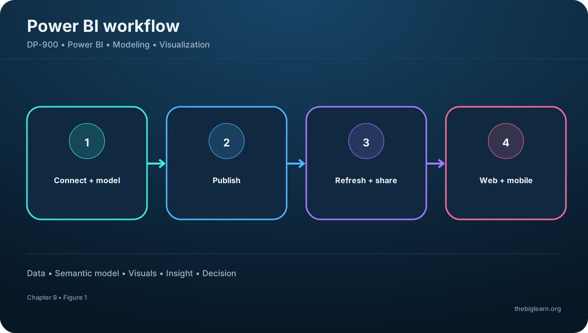
Microsoft is a suite of tools and services and a core workload. A typical solution begins in Desktop on Windows, where an analyst connects to multiple sources, transforms and combines data, builds a semantic model, and designs interactive report pages.
The analyst then publishes the model and report to the service. Business users open the published content through a browser or the mobile app, while creators continue to maintain the model and report.
Figure 1 - The workflow
Topic summary
The core flow is connect and model in Desktop, publish to the service, and consume securely on web or mobile.
3. service, sharing, refresh, dashboards, and apps
The service is the cloud environment for publishing and interacting with reports. It supports basic browser-based modeling and report editing, although Desktop offers broader authoring capabilities for many scenarios.
In the service, teams schedule source refreshes, grant access, share reports, create dashboards that combine important tiles, and package related reports and dashboards into apps that provide a focused experience for an audience.
Topic summary
The service operationalizes content through refresh, access, sharing, dashboards, apps, and browser consumption.
4. inside
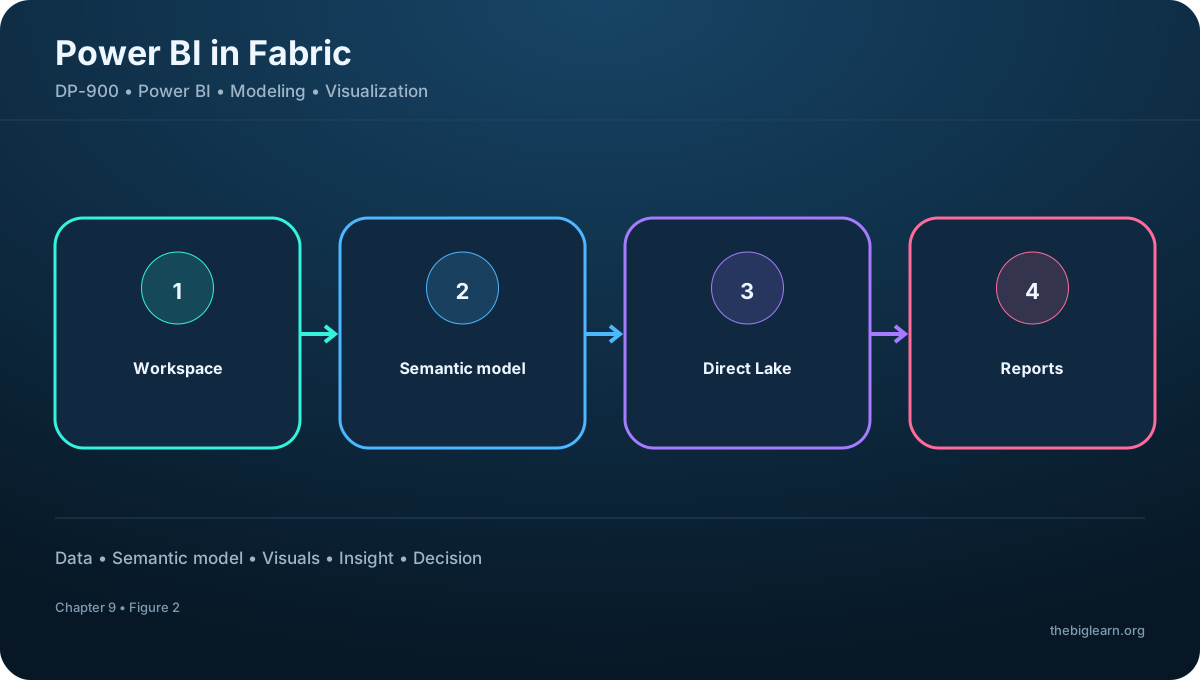
is integrated with . Reports and semantic models live in shared workspaces beside engineering and analytics items, with OneLake as the common storage foundation. A semantic model can define measures, relationships, and hierarchies once and support multiple reports.
Direct Lake lets query data in OneLake without a separate import-and-refresh cycle, combining lake scale with responsive analysis. Browser editing also enables teams to create or update reports without installing Desktop, though capabilities differ by authoring experience.
Figure 2 - inside
Topic summary
Fabric places models and reports beside other analytics assets, while Direct Lake connects semantic models directly to OneLake data.
5. AI assistance in the analyst workflow
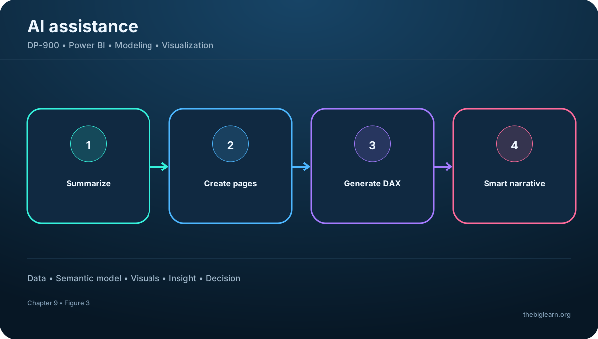
Copilot in can summarize a report in plain language, create report pages with suitable visual types from a prompt, and generate DAX measure expressions from natural-language requirements. The referenced module states that Copilot requires Fabric capacity F2 or higher or Premium capacity P1 or higher.
The smart narrative visual does not require a Copilot license and creates a dynamic written explanation that updates with the report data. AI assistance accelerates authoring, but analysts still validate measures, filters, visual choices, and conclusions.
Figure 3 - AI assistance in the analyst workflow
Topic summary
Copilot assists with summaries, pages, and DAX; smart narratives explain changing results, while human validation remains essential.
6. Semantic models, measures, and dimensions
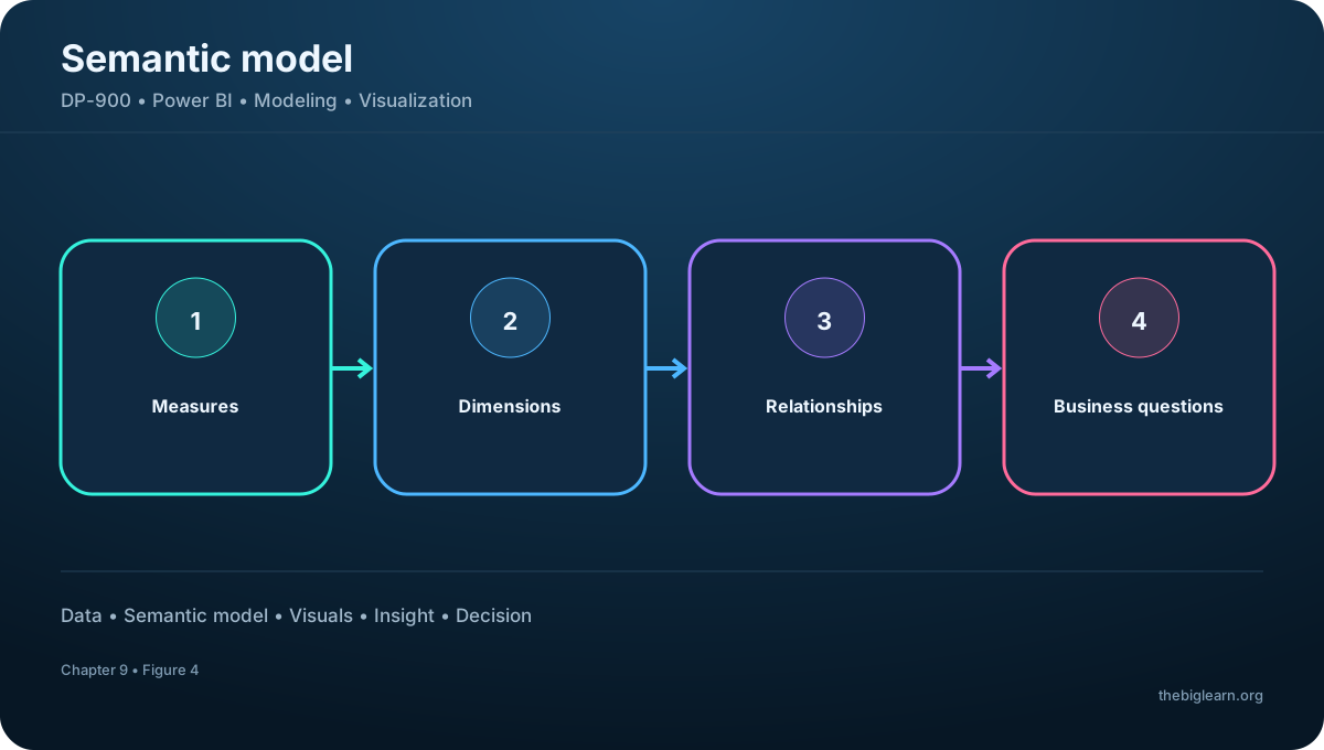
An analytical model - called a semantic model in and - arranges related tables for analysis. Measures are the numeric values to aggregate, such as revenue, cost, quantity, or margin. Dimensions describe the entities and perspectives used to group or filter those measures, such as product, customer, geography, and time.
A model can answer total revenue by customer, quantity by product, or monthly revenue by product category because relationships connect business events to their descriptive dimensions.
Figure 4 - Semantic models, measures, and dimensions
Topic summary
Measures answer how much; dimensions answer by what business perspective the number should be grouped or filtered.
7. Fact tables, dimension tables, and schema design
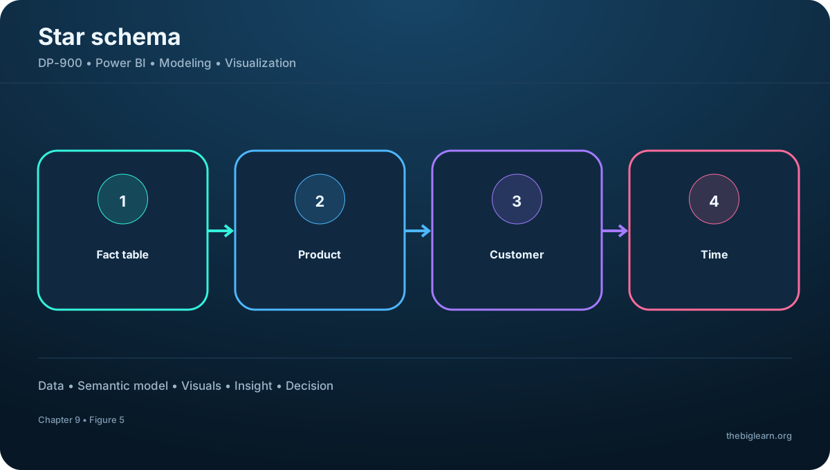
A dimension table represents an entity such as Product or Customer. Each row has a unique key and descriptive attributes such as name, category, or city. A Time dimension is common because most business analysis groups facts into days, months, quarters, or years.
A fact table records measurable events, such as sales transactions with quantity and revenue, and stores keys that relate each event to dimensions. A direct set of fact-to-dimension relationships forms a star schema. If a dimension links to more detail tables - for example Product to Category - the result is a snowflake schema.
Star and snowflake schemas
Design
Relationship pattern
Trade-off
Star
Fact connects directly to dimensions
Simple and efficient for analysis
Snowflake
Dimensions connect to additional detail tables
More normalized, with extra relationships
Figure 5 - Fact tables, dimension tables, and schema design
Topic summary
Facts store measurable events, dimensions provide descriptive context, and their relationship pattern produces star or snowflake schemas.
8. VertiPaq and query-time aggregation
When data is imported into a semantic model, the VertiPaq engine stores it in an efficient in-memory columnar format. Columnar storage compresses repeated values and supports fast scans over analytical columns.
Aggregations are calculated when a query runs rather than being permanently stored for every possible combination. Filters and relationships establish context, and the engine computes the requested totals at the appropriate grain.
Topic summary
VertiPaq combines compressed columnar storage with query-time calculations for responsive analytical reporting.
9. Hierarchies and model design in
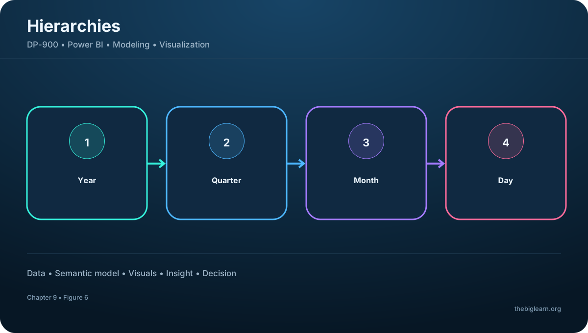
A hierarchy defines ordered levels for drill-up and drill-down. Product can move from category to item, Customer from region to city to customer, and Time from year to month to day. Selecting a higher level summarizes values; drilling down requests a more detailed aggregation.
In Desktop Model view, analysts create table relationships, define hierarchies, assign data types and display formats, and configure properties that shape analysis. For OneLake data, Direct Lake connects the semantic model to lake files while retaining high-performance query behavior without a separate import step.
Figure 6 - Hierarchies and model design in
Topic summary
Hierarchies enable controlled movement between summary and detail; Model view defines the relationships and metadata that make it reliable.
10. Tables, cards, bar charts, and line charts
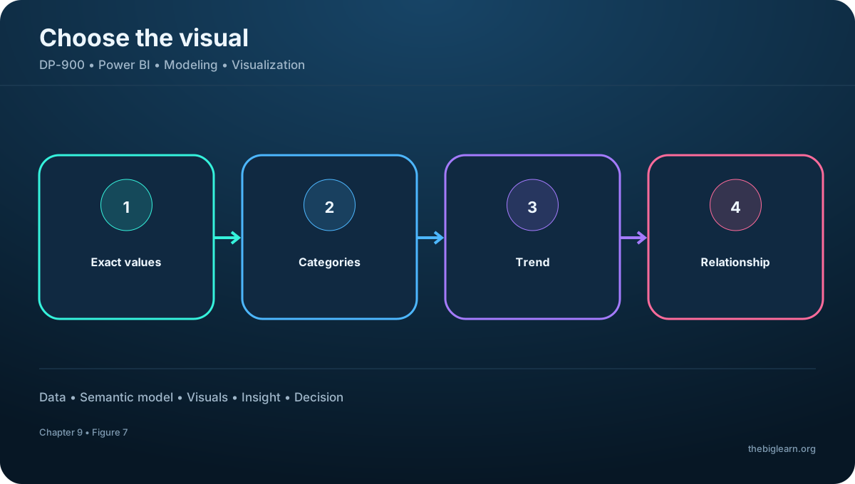
Tables are appropriate when readers need many related values or exact detail. Cards emphasize a single important value such as total revenue, count, or rate. These formats favor precision and immediate recognition.
Bar and column charts compare numeric values across discrete categories. Line charts are particularly effective for trends across an ordered sequence, most commonly time. When comparing pass rates for several exams over multiple periods, a line chart exposes direction and change more clearly than a pie chart.
Match the visual to the question
Visual
Best suited to
Table
Exact related values
Card
One important metric
Bar or column
Comparison across categories
Line
Trend over an ordered axis
Figure 7 - Tables, cards, bar charts, and line charts
Topic summary
Choose tables and cards for exact values, bars for category comparison, and lines for change over an ordered axis such as time.
11. Pie charts, scatter plots, and maps
A pie chart expresses categories as proportions of one whole and works best with a limited number of clearly different slices. Too many categories or similar values make angle and area comparisons difficult.
A scatter plot places two numeric measures on axes to reveal association, clusters, and outliers; it does not by itself prove causation. Maps compare values by geographic area or location and should be used only when location contributes to the analytical question.
Topic summary
Pie charts show a simple part-to-whole view, scatter plots explore two-measure relationships, and maps add meaningful geography.
12. Interactivity and AI-driven visual exploration
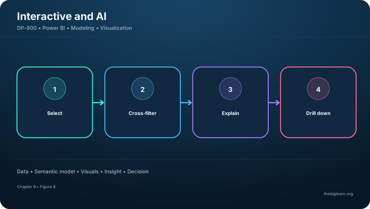
Visuals on a report page can be linked automatically. Selecting a city, category, or data point cross-filters or highlights related visuals so the user investigates the same context across the page. This turns a static collection of charts into an exploratory report.
Smart narratives generate dynamic explanations. Q&A accepts plain-English questions and returns visual answers based on the semantic model. Key influencers identifies factors most associated with a selected outcome, and the decomposition tree supports interactive drill-down across several dimensions to explain contributions.
Figure 8 - Interactivity and AI-driven visual exploration
Topic summary
Cross-filtering connects visuals; AI visuals help users describe, question, prioritize influences, and decompose a result.
13. Hands-on exercise and assessment reasoning
The guided exercise takes about 20 minutes and requires a Windows computer. Its purpose is to practice creating a model and interactive report in Desktop, then observe how fields, relationships, and visuals work together.
For assessment questions: use Desktop to import from multiple sources and create a report; define a hierarchy for drill-up and drill-down; and use a line chart to compare exam pass rates over time. The broader exam pattern is to map each question to workflow stage, model element, or visual purpose.
Topic summary
For DP-900, distinguish authoring from consumption, measure from dimension, relationship from hierarchy, and each visual by the analytical comparison it serves.